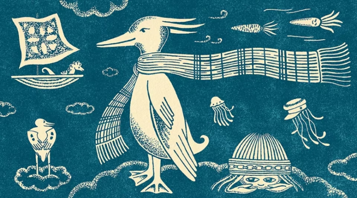
The Perfect Imperfection Of
Hand Drawn Illustrations
The Perfect Imperfection Of Hand Drawn Illustrations
In a world increasingly built from templates, grids, stock imagery and perfectly rendered digital assets, there is something unexpectedly powerful about a line drawn by hand. It may wobble slightly. A curve may not be mathematically perfect. Two seemingly identical forms may contain tiny differences.
And that is precisely why we notice it.
Hand-drawn illustration brings something into brand communication that polished digital systems often struggle to manufacture: ‘evidence of a human presence’. For brands, that presence can be incredibly valuable.
Human beings are remarkably sensitive to irregularity.
Our eyes notice differences in texture, rhythm, proportion and movement almost instinctively. A hand-drawn line carries all of these small variations. The pressure of the tool changes. The thickness shifts. A shape bends slightly differently from the one beside it.
These imperfections are not necessarily perceived as mistakes. Instead, they communicate that ‘someone made this.’ That distinction matters psychologically. When an image feels handmade, we instinctively associate it with qualities such as care, intention, time, individuality and craftsmanship. Even when we know that the finished illustration has ultimately been digitised, the visual language still retains traces of its making. A hand-drawn illustration therefore does more than depict an idea. It communicates the presence of the maker behind it.
Beauty often lives in controlled
imperfection
Digital design allows extraordinary precision. Lines can be perfectly straight, circles mathematically exact and compositions aligned down to a fraction of a pixel. But beauty has never depended entirely on perfection. Across art, architecture, textiles, ceramics and craft traditions, many of the objects we consider beautiful contain subtle variation. The irregularities give them character.
Illustration works in much the same way. A hand-drawn motif repeated twenty times will rarely look exactly the same twenty times. Those tiny differences create visual movement and texture. The eye travels through the composition rather than instantly decoding and dismissing it.
This is one reason illustrated branding can feel warmer and richer than highly standardised visual communication. It gives the eye something to discover.
Hand-drawn visuals can make brands easier to remember
Most categories today suffer from visual convergence. Technology companies adopt similar gradients. Luxury brands use similar restrained typography. Wellness brands gravitate towards similar neutral palettes. Hospitality brands often rely on the same beautifully photographed interiors. Individual elements may be well designed, yet together the category begins to look remarkably similar.
Illustration offers brands an opportunity to create a visual world that is far more difficult to replicate. A particular drawing style can become as recognisable as a logo. The shape of the line, the proportions of characters, the treatment of colour, the density of detail and even the humour within the drawings can form a distinctive visual language. Over time, audiences may recognise the illustration style before they consciously recognise the brand name. That is powerful brand memory.
The strongest visual identities are rarely collections of isolated assets. They are ‘systems of recognisable behaviour’. Illustration can become one of those behaviours.